Samsung’s Smarter Way to Use Wear OS Tiles: Samsung has taken a fresh approach to Wear OS Tiles on the Galaxy Watch 8, and honestly, it’s a big step forward. Instead of swiping through one app at a time, you now get grouped Tiles that make much better use of the screen space.
For example, I just turn the rotating bezel once and land on a “Health” Tile. It shows my daily goals, energy score, sleep data, breathing exercises, and even ECGs. I added more info like blood oxygen and antioxidant levels, but you can also add things like cycle tracking or medications, whatever matters most to you.
Galaxy Watch 8 Tiles Are The Best Upgrade In One UI 8 Watch
Next, there’s a “Fitness” Tile that shows quick access to workouts, the Running Coach, body composition, and friendly step challenges. Then there’s a “Basic” Tile with everyday tools like weather, calendar, battery level, and music controls.
It feels a bit like Apple’s smart stack, but with Android’s signature customization. You get to organize apps into smaller, themed sections rather than having everything dumped into one big list.
Samsung also gives you two layout options for its Tiles. You can choose a slim rectangle that fits two items on one screen or a taller squircle that fills most of the space while hinting there’s more info below. That way, you can highlight a key app but still group others nearby.

Unfortunately, Google and third-party apps can only use the traditional full-size Tile layout for now. For instance, Google’s Gemini Tile already shows the new Wear OS 6 design, but doesn’t support these grouped views.
Hopefully, Samsung will open this up to more developers soon, because these grouped Tiles have quickly become one of my favorite features. I can fit more useful tools into my daily routine without wasting space on apps I only use occasionally.
Two Watches, Two Tile Styles
After trying out Google’s Wear OS 6 at I/O, I liked how its redesigned Tiles filled the screen and let you quickly grab info or use shortcuts without opening the app. But now that I’ve spent time with Samsung’s version, I’m starting to prefer it.
Samsung’s layout feels more like setting up your Galaxy phone’s home screen. Everything is grouped and easy to swipe through, like a well-organized dashboard. Google’s version feels a little more boxed in, likely designed with the Pixel Watch and its minimalist style in mind.
Maybe it’s just because Samsung’s design is fresh in my mind, but I really like seeing more info at once, even if it’s a bit smaller. Scrolling through one Health Tile with several options is way easier than trying to remember which Tile does what.
To be fair, I’ll reserve full judgment on the Pixel Watch 4 until I can test it more. But right now, Samsung’s new Tiles feel like a real upgrade. They’ve made me use apps I usually ignored on my Galaxy Watch Ultra, simply because I ran out of room or didn’t want to dig through the app drawer.
The good news is that this new Tile experience is coming to other Galaxy Watches later this year. Still, the Galaxy Watch 8 and 7, with their new Exynos W1000 chip, make scrolling feel extra smooth. So if you’re excited to try it, I wouldn’t blame you; these new Tiles really are that good.
A New Kind of Classic
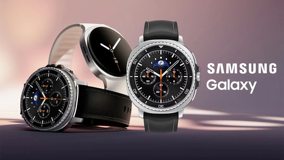
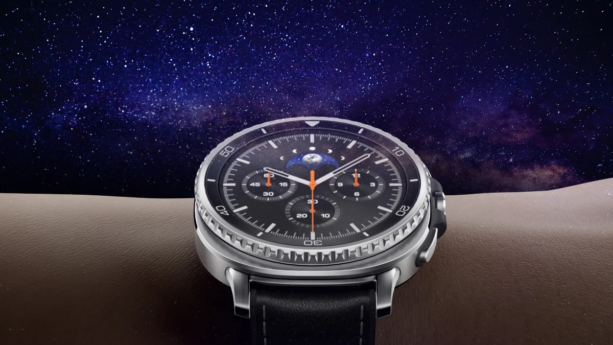
The Galaxy Watch 8 Classic takes everything great about the Ultra and brings back the fan-favorite rotating bezel. It’s a fresh design that might not scream “classic” at first glance, but it looks great in person. Plus, it packs the powerful new chip, improved health sensors, and GPS, and a shortcut button that longtime Watch 6 Classic users will appreciate.
ALSO READ: How to Take Screenshots on Samsung Phones: Easy Guide


