

Apple Changed the Entire Look with iOS 26 Update, But Users Didn’t Like It
As soon as Apple’s iOS 26 update was announced, it created a lot of buzz in the tech world. But once users started using it, most of the reactions on social media turned negative. Apple rolled out a new interface called Liquid Glass across its entire ecosystem, including iPhone, iPad, Mac, Apple Watch, and Apple TV. The goal was to offer a modern, clean, and shiny experience, but users didn’t feel what Apple had expected.
- Apple Changed the Entire Look with iOS 26 Update, But Users Didn’t Like It
- Liquid Glass Design: Transparent Look Affected Readability
- People Question Apple’s Design Team After Disappointment
- One Look for All Devices, But Many Functional Problems
- iOS 26 Developer Beta Is Out, Full Release Expected in September
- Apple Intelligence Updates Were Expected, But Focus Remained on Liquid Glass
- Final Opinion: iOS 26 Looks Good, But It’s Not Easy to Use
People across social platforms shared their views, calling the new design ugly, confusing, and uncomfortable for the eyes. One user wrote, “Liquid Glass Design is the worst thing Apple has ever done.”
Liquid Glass Design: Transparent Look Affected Readability

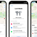
The biggest change in the iOS 26 update is the Liquid Glass UI, which brings a translucent and reflective appearance. This time, Apple removed the flat and simple design and added dynamic elements like transparent buttons, glass-like sliders, and background blur effects.
All these elements work using real-time rendering. While Apple said the look is beautiful and rich, users felt it was disturbing. Many people said that text is not clearly visible, icons look blurry, and the contrast is so low that reading notifications or pressing buttons has become hard.
One user said, “Liquid Glass UI has made using my iPhone difficult. Everything is blurry and hard to read.” Another user added, “This design looks like interns were locked in a room with crayons and told to create something.”
People Question Apple’s Design Team After Disappointment

After the release of the iOS 26 update, many users also started blaming Apple’s design team. One person wrote, “This has made a joke out of Apple’s design legacy. If Steve Jobs was here, he would have removed the entire team.”
Some people believe Apple has given up on simplicity and clarity just to make the design look fancy. While Liquid Glass may look new, it is creating real trouble for people who use their phones daily.
One Look for All Devices, But Many Functional Problems
The iOS 26 update is a big shift for Apple because for the first time, the same theme has been used across all its platforms. Whether you use an iPhone or a Mac, the same Liquid Glass look is now everywhere.
Apple also changed its naming system. Now, instead of version numbers, the release year is being used. That’s why all platforms now have version number ‘26’ like iOS 26, macOS 26, watchOS 26, and so on.
While Apple calls this uniform style a smart move, users are calling it confusing and full of problems.
iOS 26 Developer Beta Is Out, Full Release Expected in September

Right now, the iOS 26 update is only available as a developer beta. This means only registered developers can try it. The full and stable version is expected to launch publicly around September.
Those who have tried the beta version say the update is the opposite of what they expected. People usually expect Apple to bring high-quality design and smooth functions, but this time most of the feedback has been negative.
Apple Intelligence Updates Were Expected, But Focus Remained on Liquid Glass

At WWDC 2025 many people were hoping that Apple would show big updates to its AI system called Apple Intelligence. But there were only a few small additions. Some features like live translations for Messages, FaceTime, and Phone apps were added.
iOS 26 also introduced a new visual intelligence tool, where users can take actions on anything showing on their iPhone screen. Apple has added third-party tools like ChatGPT, Google, and Etsy, so people can ask questions or search for similar products easily.
Final Opinion: iOS 26 Looks Good, But It’s Not Easy to Use
Apple’s iOS 26 update is a major design change, but the response from users has not been positive. The new visual style and consistent look on all devices may sound good in theory, but they don’t work well in real use.
The design is so shiny and transparent that basic things like readability and accessibility have been affected. Apple calls it their most beautiful UI ever, but loyal users are calling it one of their worst decisions.
Now it will be interesting to see whether Apple fixes these issues before the final release or whether users will have to adjust to this look.
ALSO READ: Best VPN for iPhone in 2025: Privacy, Speed, and Online Freedom Together